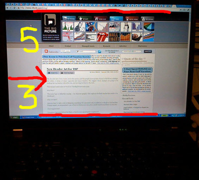
Page layout: above the scroll
Basic principle of web design: If it's not on the screen, I can't see it.
Here we see Barry Ritholtz' Big Picture. On a T61 laptop in a high resolution mode, more than 60 percent (5 inches) of the screen is used for static branding graphics, and only 3 inches is available for the actual content.
The Big Picture is a timely survey of economic news and views. In its own words, it tries (and I think succeeds)
to give you a unique combination of original content, as well as referencing the best of what I find elsewhere -- MSM, Wall Street, Video, other blogs. Typically, I post a long, original piece in the early morning. Several additional pieces during the day pull information from elsewhere -- charts, news, other resources. The goal is to provide a steady stream of relevant information -- leavened with my perspectives -- all day.
