Main

February 1, 2012

Gamification is superficial


Game techniques, Mr. Duggan says, prompt consumers to spend more time on company Web sites, contribute more content and share more product information with Facebook and Twitter adherents. One of his clients, he says, uses a gamification program to collect information about 300 actions -- like posting comments or sharing with a social network -- performed by several million people.

But critics say the risk of gamification is that it omits the deepest elements of games -- like skill, mastery and risk-taking -- even as it promotes the most superficial trappings, like points, in an effort to manipulate people.

Ian Bogost, a professor of digital media at the Georgia Institute of Technology, for example, refers to the programs as "exploitationware." Consumers might be less eager to sign up, he argues, if they understood that some programs have less in common with real games than with, say, spyware.

"Why not call it a new kind of analytics?" says Professor Bogost, a founding partner at Persuasive Games, a firm that designs video games for education and activism. "Companies could say, 'Well, we are offering you a new program in which we watch your every move and make decisions about our advertising based on the things we see you do.' "

Gamification may not sound novel to members of frequent-flier or hotel loyalty programs who have strategized for years about ways to game extra points. But those kinds of membership programs offer concrete rewards like upgrades, free flights or free hotel stays. What's new about gamification is its goal of motivating people with virtual awards, like a mayoralty on FourSquare, that have little or no monetary value.


What would Amy Jo Kim or Justin Hall have said ?


Continue reading "Gamification is superficial" »

January 8, 2012

Lighting apartments


"You want to maximize the amount of times that daylight bounces inside the room," Mr. Tanteri said. To do so, he suggested using light colors that are "close to white" on ceilings, walls and floors, and avoiding glossy finishes. "Glossy surfaces can actually be a detriment because they can create glare," he said. "The safest finishes are matte finishes, because they reflect light in all directions."

¶ Mr. Steinberg also recommends using light hues, and offered specific paints. "Linen White by Benjamin Moore is a very reliable, sell-your-house coat of paint," he said. He suggested another Benjamin Moore color, Decorators White, for the ceiling and trim.

¶ On a related note, Mr. Tanteri said: "You don't want to cover the wall with dark hangings. Paintings and posters will absorb light."

¶ As for reducing light obstructions, "Orient objects in the room to promote the flow of daylight," he said. "So, things like bookshelves and partitions should be perpendicular to the window wall."

¶ Mr. Tanteri also says that light from the top of a window will reach the farthest into the apartment, so it is important not to block that part of the window with heavy blinds or drapery.

¶ He favors Venetian blinds because they provide solar control and can also redirect sunlight to the ceiling. "That's when you get deeper daylight penetration," he said. Another option: shades that travel from the bottom of the window upward, rather than top down. "That's something that works for daylight as well as privacy," he said.

¶ And you can supplement the sunlight with strategically placed light fixtures. "Use indirect lighting, aimed at the ceiling," Mr. Tanteri said. A torchier floor lamp near the back of the room could "take over where the daylight on the ceiling starts to fade away."

Continue reading "Lighting apartments" »

August 11, 2011

Talk to Me | on the way to the exhibition


The Museum of Modern Art's "Talk to Me: Design and the Communication Between People and Objects" is one of the smartest design shows in years.

The show is certainly a brave undertaking for a design department that's still strongly associated with 20th-century modernism. It's a big step from a Corbusier chair to an iPhone, or as senior curator Paola Antonelli, puts it, "from the centrality of function to that of meaning."

Talk to Me | on the way to the exhibition


August 1, 2011

Workers in the office 'bull pen' are having their day


Safdie's Columbus Circle was a reaction to the postwar dominance of international style as the new language of office architecture just as much as it was a reaction to the empty ornamentation of postmodernism. In his design, you can see certain parallels with the Institute of Peace; the curved atriums, floor-to-ceiling windows, and connecting bridges are Safdie's attempts at humanizing office space. This 1945 blurb from an architectural magazine quoted in Reinhold Martin's The Organizational Complex could've described Safdie's work:

The workers in the office 'bull pen' are having their day, and more is being done for them. They are getting not only better light, better ventilation and better working conditions, but also improved and more cheerful surroundings.
Yet the cumulative effect produces few changes in how an average worker inhabits and interacts with her surroundings. Perhaps this is confirmed by the faulty experiments of sociologist George Mayo in the 1920s. Mayo set up shop in the Chicago Western Electric factory and altered such factors as light intensity and length of breaks in order to determine which elements increased worker productivity. Mayo found that, amongst other conditions, better lighting improved worker output. Decades later, the results of the experiments were re-examined and then discredited. Researchers determined that worker output had not increased or decreased based on external factors like light, but due to the worker's sense that she was the subject of an experiment. This was dubbed the Hawthorne Effect.

-- Leah Caldwell, Syrian expert.

July 20, 2011

Incenting cooperation Piaza Nath


Tested by Rexford.

April 20, 2011

Americans like workds; Europeans, symbols


"The use of symbols rather than words, for example, is a cheap if irritating solution to the problem of selling appliances in a linguistically diverse market."

06_Bosch-oven.jpg

We're No. 1!
But only when it comes to domestic appliances. (Slate)
By Mark Vanhoenacker
Posted Wednesday, April 6, 2011, at 8:15 AM ET

April 13, 2011

A new breed of self-curating, design-smart amateurs spurred to resourcefulness


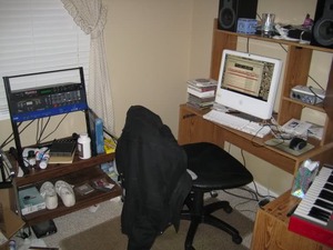
As shelter magazines foundered, up came a new breed of self-curating, design-smart amateurs spurred to resourcefulness by the recession and assisted by the Internet in finding materials and furnishings at deep discounts. The result is an outpouring of homegrown inventiveness -- sofas upholstered with burlap coffee sacks, stereo speakers made from Ikea salad bowls, party decorations conscripted as permanent ornamentation.

Every offbeat detail is critiqued and discussed in the comment fields of design Web sites. For the moment, the grass-roots novices have upstaged the experts. The amateurs "aspire to a certain level of interior design, but professional help is beyond their reach," Ms. Lemieux said. "So they go at it their own way. Now they're the authorities."

Ms. Lemieux's amateurs are not trying to imitate the polished work of a master, as, say, the culinary enthusiast Julie Powell did when she faithfully worked her way through the Julia Child oeuvre. On the contrary, the movement -- it's more accurate to call undecorating a movement than a single identifiable style -- takes subversive pleasure in breaking the rules. Harmony and balance are passé. Excess is encouraged. Fabrics are mismatched. Wallpaper spreads over moldings and ceilings.

Anything goes, as evidenced by a Chicago couple who parked an Airstream trailer in their loft. While modernism wagged a disapproving finger at those who dared breach its formal orthogonal lines and rigid color palette, undecorating delights in residential anarchy. "There's no longer any good or bad," said Maxwell Gillingham-Ryan, a founder of Apartment Therapy, a home design blog. "That new openness is the story. We're all swirling around together."

Mr. Gillingham-Ryan started his site seven years ago to help galvanize the growing ranks of design-literate amateurs discontented with the role of passive consumer. Its audience has swollen to five million unique visitors a month, an increase of 166 percent in two years.

If Mr. Gillingham-Ryan is the populist hub of the emergent do-it-yourselfers, their aesthetic hero is Todd Selby, a photographer whose three-year-old Web site, the Selby, has become an indie version of Architectural Digest. Organized as a series of visits to the homes of writers, musicians and other creative types, the site shows rooms filled with artful clutter -- taxidermy, thrift shop paintings, exquisitely peeling wallpaper.

The central tenet of the undecorate movement is that personal expression matters more than professional polish. In keeping with that sentiment, the Selby reflects the outlandish, idiosyncratic taste of the residents. "It's still in the underground phase," Mr. Selby said of his sensibility, "but it's starting to break through." Last year Mr. Selby published "The Selby Is in Your Place," a collection of roughly a thousand photographs and sketches from his site.

Continue reading "A new breed of self-curating, design-smart amateurs spurred to resourcefulness " »

April 8, 2011

Architecture critics detest Trump complex on Riverside South


Xanadu Mall in NJ is almost as bad a a Trump project.


In the New York region, "the only thing comparable would be Trumpville on the West Side Highway. It beats Xanadu in its sheer mass, and its brutal imposition on the eyes of millions of people."

MELISSA LAFSKY

Editor in chief of the Web site The Infrastructurist


I know various people have said the whole Trump complex on Riverside South is worse, and it is pretty bad."

PAUL GOLDBERGER

Architecture critic of The New Yorker


N.Y. / REGION
Fix Xanadu? The Problem May Be Where to Begin

By RICHARD PÉREZ-PEÑA
Published: April 1, 2011
Architectural experts offer thoughts on rescuing a stalled New Jersey Meadowlands mall project that has already soaked up $2 billion.

January 3, 2011

How we live: Clean my computer room


Real scenes of real estate and dealing with clutter.

clutter_5_33vke86.jpg

[ via StyleForum ]

Continue reading "How we live: Clean my computer room" »

October 28, 2010

Is quality of life about square footage ?


During the last decade's real estate boom, the annual demonstration kept up with the times: designs abounded with baronial features like colonnades, cathedral ceilings and observation towers, and they sometimes topped 6,000 square feet. But then the crash came, wiping out credit lines and shaking the industry's confidence. For this year's show, Boyce Thompson, the editorial director of Builder, wanted a look more attuned to curtailed appetites, so he came up with a concept that he called a Home for the New Economy.

The most salient specification of the house was its modest proportions. At around 1,700 square feet, it was the size of the average American home built in 1980. Since then, new houses have on average grown by more than 40 percent, as dens have expanded into great rooms, and tubs and sinks have multiplied. "Houses got too big, because people were chasing investment gains and there was cheap money, and the industry responded by building houses that were too large," Thompson says. "So we really wanted to focus people's attention on doing smaller, better homes." He points to Census statistics that show a slight decline in the size of homes built over the past two years and to a much larger drop in the square footage of those that have just started construction, and suggests that the market may be headed toward a more austere norm.

That's certainly debatable. If dissecting the causes of the housing market's crash is a task for economists, predicting its future is a fuzzier matter of sociology. Will Americans re-evaluate cultural assumptions that equate ever-larger houses with success and stability? Or will they invest more in their lived environments, figuring that with the demise of the quick flip, they are now in for the long term? In the absence of much real market activity, imaginations are free to run wild. The Home for the New Economy is one such exercise in speculation, a proposal that the future lies in denser, more walkable, modestly scaled communities. Marianne Cusato, who designed the Home for the New Economy, sees it as a rebuke to the ethic of the McMansion. "We're not going to go back to 2005," she says. "What was built then is not going to come back, and this is not a bad thing. What we were building was so unsustainable, and it didn't really meet our needs."

Cusato, who is 36, started her career drawing up million-dollar mansions, but she has made a name for herself by going smaller, designing a 300-square-foot Katrina Cottage meant to be a replacement for the trailers the government set up after the 2005 hurricane. When Cusato sat down to devise the Home for the New Economy, she tried to consider how families actually use their living areas. She started with a simple, symmetrical three-bedroom plan, excising extraneous spaces -- the seldom-used formal dining room, for instance -- while enlarging windows wherever she could and adding a wraparound porch. A result was a house that was compact, comfortable, bright and energy-efficient.

Continue reading "Is quality of life about square footage ?" »

October 3, 2010

David Choe


david_choe_index_03.gif

David Choe's asian logo (bio).

July 21, 2010

Beijing edition of Queens' Crap.


Instead, they seize property in parts of the city they deem "unhygienic and unsafe," rezone much of it as commercial property and sell it for huge profits. The concession to history often consists of a few new buildings with upturned eaves and garishly painted timber slapped on concrete facades.

Aarguments have had limited impact on this redevelopment-crazed city. In recent years, two-thirds of Beijing's 3,000 narrow lanes, known as hutongs, have been subsumed by mega-developments, many of them in neighborhoods that were officially designated preservation zones.

Continue reading "Beijing edition of Queens' Crap." »

May 17, 2010

G. O. P. sweatshirt


elephant_p57Qa.jpg

See also Republican Theme Park.

Continue reading "G. O. P. sweatshirt" »

November 13, 2009

Good Shoes

Shoe makers that specialize in high end (not necessarily high fashion) shoes will usually overhaul and resole shoes for you with original parts. Alden, Edward Green, John Lobb, Allen Edmonds, heck even Cole Haan will all do this for you.

Generally, shoe makers who specialize in "fashionable" shoes - Gucci, Ferragamo, etc. intend for the shoes to be more or less disposable. Since they aren't necessarily in the business of making "classic" shoes, generally by the time the sole wears out the shoe is either shot to hell or out of fashion. Therefore there isn't a lot of call for resoling, especially not with the original sole.

-- Styleforum

October 15, 2009

Consumers buy more PCs than businesses

Consumers now buy more PCs than businesses do, and their wants and desires for better-looking devices have invaded the cubicle. The current breed of consumer has shown an ability to turn something like the Apple iPhone into an overnight sensation, then demand that companies embrace it. Google, meanwhile, uses its influential Web search and YouTube properties to introduce people to its e-mail, document and Web browser software, and Facebook now provides inspiration to business software makers.

For Google, winning over consumers is crucial to its strategy of infiltrating corporations and deflating Microsoft's core businesses. "We are the next generation," says Dave Girouard, the president of Google's business products division. "The big difference in technology here is the pace of innovation."

Continue reading "Consumers buy more PCs than businesses" »

August 24, 2009

Tailored especially for unrefined Americans.

2011 Volkswagen Jetta - Tailored especially for unrefined Americans.

From C&D:

"Why is VW walking away from global cars, especially at a time when other automakers are globalizing? The company feels that American and Asian customers don't appreciate the refinement of its current offerings. "U.S. customers look at car size and engine displacement. They won't pay a dollar extra for a Passat over the Camry just because of its finesse and attention to detail," a company executive told us in Wolfsburg."

I hope that VW realizes that many of us by a VW JUST because they are refined - and are willing to pay a little more. Build your car for the masses - just please keep sending the Passat, Golf, etc., for those of us who appreciate the difference.

Continue reading "Tailored especially for unrefined Americans." »

January 13, 2009

Page layout: above the scroll

Basic principle of web design: If it's not on the screen, I can't see it.

ritz_2_screen2.jpg

Here we see Barry Ritholtz' Big Picture. On a T61 laptop in a high resolution mode, more than 60 percent (5 inches) of the screen is used for static branding graphics, and only 3 inches is available for the actual content.

The Big Picture is a timely survey of economic news and views. In its own words, it tries (and I think succeeds)

to give you a unique combination of original content, as well as referencing the best of what I find elsewhere -- MSM, Wall Street, Video, other blogs. Typically, I post a long, original piece in the early morning. Several additional pieces during the day pull information from elsewhere -- charts, news, other resources. The goal is to provide a steady stream of relevant information -- leavened with my perspectives -- all day.

January 5, 2009

Status: either too early to tell or too late to change; Tufte on design consulting

Products under development "are in one of two states--either too early to tell or too late to change.''

He finished the book in 1982, after moving to Yale. No publisher would print it to his exacting standards. Tufte wanted the book to exemplify the design principles he articulated. It had to have lavish, abundant, high-resolution images and footnotes alongside the text so a reader wouldn't have to flip pages to find a reference. The book had to be printed on thick, creamy paper and sell for a reasonable price, about $30. "Publishers seemed appalled at the prospect that an author might govern design,'' he later wrote. So he took out a second mortgage at nearly 18 percent interest and produced the book himself.


---- Edward Rolf Tufte

Continue reading "Status: either too early to tell or too late to change; Tufte on design consulting" »

December 27, 2008

Best building, 2008: Peking International Express

In Beijing, it didn't matter what the Dow was, of course, since the Chinese government's decision to make itself the world's leading patron of architecture was dependent on other things, including cheap labor. In time for the 2008 Olympics, the world saw the fruits of China's decision to put aside nationalism, hire the greatest architects from around the world, and let them do the kind of things they could never afford to do at home. That brought us two of the greatest buildings of the year, Herzog and de Meuron's extraordinary Olympic Stadium, the stunning steel latticework structure widely known as the Bird's Nest; and Norman Foster's Beijing Airport, a project that was not only bigger than any other airport in the world, but more beautiful, more logically laid out, and more quickly built. And the headquarters of CCTV, the Chinese television network, by Rem Koolhaas and Ole Scheeren, of the Office for Metropolitan Architecture--a building which I had thought was going to be a pretentious piece of structural exhibitionism--turned out to be a compelling and exciting piece of structural exhibitionism.

-- Paul Goldberger, the New Yorker's architecture critic.

Continue reading "Best building, 2008: Peking International Express" »

November 20, 2008

Charles Tyrwhitt, cursed shirts ?

Fact: Charles Tyrwhitt New York City store #1 is located at Madison Avenue & 46th Street, on the ground floor of the ex-Bear Stearns corporate headquarters

Fact: Charles Tyrwhitt New York City store #2 is located at 7th Avenue & 50th Street, on the ground floor of the ex-Lehman Brothers corporate headquarters

Fact: Bear Stearns is toast

Fact: Lehman Brothers is even toastier

Conclusion: The shirts are cursed.

Shirt reviews; financial analysis by LongOrShortCapital.

October 24, 2008

Seen on the street

Bill Cunningham narrarates what he saw this week on the street in NY.
Also, the time-progress slider has a nifty usable burst-up preview.

Continue reading "Seen on the street" »

October 23, 2007

SOIFFER•HASKIN / HICKEY FREEMAN

SOIFFER•HASKIN
Cordially invites you to
a private sale of HICKEY FREEMAN

Men's Clothing, Furnishings
& Sportswear

Also a limited selecton of
Bobby Jones Women's Cashmere Sweaters

Sunday, Oct. 28th through Thursday, Nov. 1st
Sunday: 9:00am to 6:00pm
Monday through Wednesday: 9:00am to 6:30pm
Thursday: 9:00am to 5:00pm

To be held at:
Soiffer Haskin
317 West 33rd Street, NYC
(Just west of 8th Avenue)

Credit Cards Only
(American Express, Visa or MasterCard)
All Sales Final.
Strollers not allowed. No children under 12 will be admitted.

For more information, call (718) 747-1656,
Monday through Friday: 9:00am to 5:00pm.
Soiffer Haskin, 10 Bank Street, White Plains, NY 10606
www.soifferhaskin.com

August 22, 2007

the sartorialist

thesartorialist, style and photography for fashion's sake.
1 *
2 **,

October 11, 2006

WCBS NYC TV News

CBS in NYC: wcbs TV in New York City: news, topstories,
with non-hideous website design.

September 10, 2006

Alt text mugshot

Alt text is great for web pages; but for e-mail,
better would be to default to plaintext.

Message from the nice International Mountain Bicycling Association (IMBA) Subaru VIP Program.

July 14, 2006

Shakespeare @ google: soliloquy search

Comedy, tradedy, romance. The elegant design
of Shakespeare's life work.

Not yet: Browse by or search for work's name Hamlet, character
name Ophelia or search for content text nunnery.

June 20, 2006

GraphPaper / Christopher Fahey

Graph Paper / Christopher Fahey.
Beautiful design, and observations about information architecuture.

Example: full-focus states.

June 9, 2006

Matte black on Autoblogging Friday

Matte black looks great on the new Honda Civic Type-R.
Analysis. Would look good on a new Bangled 5er or
Lexus IS, too, with their superflouos stealth
fighter curves.

Update 2006 Nov:

As show-stopping designs go, none proved more popular
with the paparazzi than a black 575-horsepower Mercedes
-Benz CLS55. This wicked witch was built by a noted
customizer, Matthew Figliola of Ai Design in Tuckahoe, N.Y.
The car’s buffed matte black paint looked like burnished
steel. Why did it work?

Because of the “flop”, said Mr. Foose, who is also host of a
customizing show, “Overhaulin’,” on the Learning Channel.
The flop is the break in light and dark shading across a vehicle’s
character lines.

“When you bring in a matte color, it may have a really beautiful
flop to it,” Mr. Foose explained. “You know, a light side and a dark
side, and your eye can focus on that surface. With all the polished
and reflected surfaces around it, it gives a quality texture.”

Mr. Foose uses matte or flat black surfaces to relieve the
“Christmas ball effect” that he says can overwhelm some of
today’s more extreme designs.

“When you have a full-polished surface, all you are looking at
are reflections,” he said. “When you open the hood of a car, and
you look at the beautiful reflective body forms, you are going
down to a chrome surface on the engine, and you’re looking
at a color right next to it that is all polished. It starts looking
like a Christmas ball next to another Christmas ball next to
another one.”

The danger of dull black finishes, Mr. Foose said, is that when
they are poorly executed “it doesn’t convey quality.”

“It’s kind of like, ‘O.K., we didn’t have enough money to finish
this car, so we just matte-finished it.’ ”

-- SEMA 2006.


Would like to see an orange
MINI.

Continue reading "Matte black on Autoblogging Friday" »

April 26, 2006

xplane Visual thinking

Visual thinking and marketing by Xplane.

Charmingly illustrated technology and business process graphics
remind me of Richard Scary's Busyown.

April 24, 2006

Subtraction

Subtraction by NYT designerism and ia by Khoi Vinh.

December 15, 2005

Cool is when you aren't

Hips are about sexuality.
-- Joel Piaskowski, chief designer at the Hyundai Kia Design
and Technical Center in California.

Hips are also about hipness, or youth.

But these judgments are often made by designers and auto executives
who are no longer young. Something may seem hip to them because it
evokes their past; to young people, something may be cool because it
envisions their future.

-- PHIL PATTON, NYT.

Continue reading "Cool is when you aren't" »

December 9, 2005

Khoi Vinh an NYT

Khoi Vinh goes to the NYT.

December 6, 2005

Google maps mania

Google maps mania charts the
mash ups and applications.

November 26, 2005

I-64 exit 11 (MO)

A new exit from I-64 in Saint Charles County, MO.
Click on picture for full size photo pop-up.
GoogleMap of area.

I-64 westbound, Chesterfield, MO.

Missouri River bridge, from Saint Louis County northwest into Saint Charles County.

Continue reading " I-64 exit 11 (MO)" »

September 30, 2005

Housing Map

Housing Maps
the criagslist - googlemap mash up.

See also housing maps by census.

Live near the trees.

Continue reading "Housing Map" »

July 29, 2005

bad architecture in Beijing

An investigation of the not-so-subtle bad architecture in Beijing.

Three Rockets

Continue reading "bad architecture in Beijing" »

July 2, 2005

V&V: Verification, Validation

Verification: testing against specifications.
Validation: testing against operating goals.

Continue reading "V&V: Verification, Validation" »

June 30, 2005

Single point accountability

Bush believes in what is known in business as single-point
accountability. "He does not want to know that a committee or a
consortium is working together to coordinate a solution," Daniels
says. "He wants one organization, or one person, to have
responsibility; he wants to know who he can call. I can't tell you how
alien this is to the federal government, which is marvelous at evading
it."

To monitor the people or organizations responsible, Bush keeps track
of certain details—ideally, not so many that he becomes a
micro-manager, but enough to keep those he is managing alert. From
9/11 until January of 2002 many officials who had no direct connection
to the war on terror lost contact with Bush. When he began meeting
with them again, he had "a stream of informed questions about the
innards of their departments," Daniels recalls. "He makes it his
business to know a little bit about everything."

Bush knows that following through can require patience. This is new
for him: when he was with the Rangers, and in his father's White
House, he was just learning patience. Though he may still see the
fundamental issues in black and white, he can now wait to achieve his
goals. "He gives things time to work," Rice says. "He understands,
probably better than his advisers, that there is a rhythm to things."

Continue reading "Single point accountability" »

May 22, 2005

dan bricklin

Dan Bricklin: a graybeard of personal computing annotates
conferences and ponders Open Source.

May 21, 2005

baddesigns

baddesigns captures some (what else ?) bad designs.
Mostly consumer products, evaluated more from a usability than
an esthetic perspective.

Example: one tube is shampoo, one is hand lotion. Which one
would you grab as you hurry off to the gym ?