Main

April 1, 2018

Visual-artist-turned-UX/UI-designer

Visual-artist-turned-UX/UI-designer is an increasingly common career trajectory. We'll explore why this trend is happening, and examine how artistic practice involves stewardship of data sets. Whether you're an artist who'd like to pivot into UX/UI, a leader or recruiter in search of fresh approaches to product thinking, or a UXer who wants to think more like an artist in your day-to-day work, you'll come away with practical suggestions you can put into practice as soon as you'd like.

February 1, 2018

Kelly Goto, snapshot of web design at the turn of the (last) prior century

Two Asian Girl Web Design, 2000, SF.

A good design studio (or in-house team) can, however, help the client understand how certain design elements are directly tied to the business goals, and how business goals are tied to assumptions of ROI. The Web world is the business world. ROI (return on interaction) as we see it differs from traditional ROI (return on investment) by focusing on customer experience and metrics of satisfaction and success rather than traditional spreadsheet formulas. The traditional methods of analysis and measurement used by mainstream businesses are being actively applied to the Web--however even with solid metrics companies have a tendency to design haphazardly and without measurable goals in mind.

Continue reading "Kelly Goto, snapshot of web design at the turn of the (last) prior century" »

January 10, 2018

Overpromising battery life for cel phone

This is a third of a day with light use, not a day of full use.

Nevertheless, in my tests, I found the Samsung Galaxy s8 cell phone battery life to be good enough to last a full day at 75 percent brightness.

For instance, on one day, I (The Verge / Walt Mossberg ) streamed two movies and a TV show from Netflix, did a bunch of photo and video shooting, placed a few phone calls, and did email, texting, and social media posting and reading. The battery lasted about 10 hours. As it was a Saturday, the phone wasn't receiving nearly the typical weekday volume of emails, texts, tweets, and Facebook posts. But I still think that, for most people who aren't likely to be watching all that video on a work day, the S8 would get them through the day.

Here is a Ten-Hour SmartPhone Battery Test (THSPBT) for celphone usability:

  1. Stream music on Youtube Red over LTE. Mix plugged-in speakers or headphones (five hours) with Bluetooth speakers or headphones (five hours).
  2. Navigate with GoogleMaps; keeping the screen unlocked and illuminated so you can see the screen in order to navigate.
  3. Log your movement with Strava or RideWithGPS.
  4. Take ten videos of 5 minutes length, each. Edit and post ten onto Instagram / Twitter / Strava while stopped (for water, etc)
  5. Also post 10 snapchat short videos.
  6. Receive a full suite of Yelp, Twitter, Swarm, Outlook, etc notifications, whilst en route.

  7. upon arriving, is there sufficent battery to stream two netflix movies ?


January 7, 2018

Attention theft TV

Consider, for example, the "innovation" known as Gas Station TV--that is, the televisions embedded in gasoline pumps that blast advertising and other pseudo-programming at the captive pumper. There is no escape: as the CEO of Gas Station TV puts it, "We like to say you're tied to that screen with an 8-foot rubber hose for about five minutes." It is an invention that singlehandedly may have created a new case for the electric car.

As neuroscientist Adam Gazzaley and psychologist Larry Rosen put it in their book, The Distracted Mind, humans have an "extreme sensitivity to goal interference from distractions by irrelevant information."

In some ways this is a problem we have faced before: In the 1940s cities banned noisy advertising trucks bearing loudspeakers; the case against advertising screens and sound-trucks is basically the same. It is a small thing cities and towns can do to make our age of bombardment a bit more bearable.

Continue reading "Attention theft TV" »

January 2, 2018

Older consumers didn't want to admit to being old

Emporia Telecom, an Austrian cellphone company, has expanded production since T-Mobile, the largest German mobile operator, began selling its TalkPremium model for seniors. The phone has a large keypad and is built for voice- and text-messaging.

The very young and the elderly have never been target markets for high-tech companies, which focus instead on the global mainstream. But with the economic downturn reducing growth, companies are applying cutting-edge technology to the often-neglected extremes of the consumer spectrum.

...

In the 1980s, Sony tried to design products with older consumers in mind, said Fujio Nishida, president of Sony Europe. But the effort did not work and has not been tried since. Seniors rejected Sony's clock-radio with simple mechanical dials and large buttons, Mr. Nishida said.

"Even though the design was helpful for them, it turned out that a lot of older consumers didn't want to admit to being old," Mr. Nishida said. "So they didn't buy it."

Continue reading "Older consumers didn't want to admit to being old" »

December 19, 2017

Bicycle lanes are crowdsourced big data

1 TWG / Coruscation home-brew
2 NYC DOT official
3 NYC Bikemaps

4 Medium NYU Urban Science data Geoff P
5 Lanepotter ~~~~~
6 OuvosTech Ouvos.
7 Alex Morgan 'Springsteen' Bell: image classifyier

Data:


Others of interest:


  1. Spiderbikemap's Spiderbikemaps' new_york_with_background [PDF]

  2. cyclinguk.org/guide/make-tube-map-cycle-network

June 19, 2016

Linkedin + MS Word = Clippy 3.0 ?

Did Mr. Nadella, who has been at Microsoft since 1992, learn nothing from the Clippy disaster? Clippy, the animated anthropomorphic paper clip introduced in 1996, popped up unbidden in Microsoft Office programs to offer advice. "Are you writing a letter?" it would ask annoyingly. Clippy became famous for the ire it provoked and, in 2010, Time magazine included Clippy in a roundup of the 50 worst inventions of all time, along with asbestos, leaded gasoline and pay toilets.

Matthew G. Kirschenbaum, an associate professor of English at the University of Maryland and author of "Track Changes: A Literary History of Word Processing," said the move reflected a failure to understand what writers need. "Most of the most innovative writing tools now on the market position themselves precisely as distraction-free platforms," he said.

April 7, 2016

Datausa government data


Hal R. Varian, chief economist of Google, who has no connection to Data USA, called the site "very informative and aesthetically pleasing." The fact the government is making so much data publicly available, he added, is fueling creative work like Data USA.

Data USA embodies an approach to data analysis that will most likely become increasingly common, said Kris Hammond, a computer science professor at Northwestern University. The site makes assumptions about its users and programs those assumptions into its software, he said.

"It is driven by the idea that we can actually figure out what a user is going to want to know when they are looking at a data set," Mr. Hammond said.

Data scientists, he said, often bristle when such limitations are put into the tools they use. But they are the data world's power users, and power users are a limited market, said Mr. Hammond, who is also chief scientist at Narrative Science, a start-up that makes software to interpret data.

January 9, 2016

KonMari: Philosophy of household goods at rest or in service


Discard everything that does not "spark joy," after thanking the objects that are getting the heave-ho for their service; and do not buy organizing equipment -- your home already has all the storage you need.

She proposes a similarly agreeable technique for hanging clothing. Hang up anything that looks happier hung up, and arrange like with like, working from left to right, with dark, heavy clothing on the left: "Clothes, like people, can relax more freely when in the company of others who are very similar in type, and therefore organizing them by category helps them feel more comfortable and secure."

Smaller, English-only under-titles:


Such anthropomorphism and nondualism, so familiar in Japanese culture, as Leonard Koren, a design theorist who has written extensively on Japanese aesthetics, told me recently, was an epiphany to this Westerner. In Japan, a hyper-awareness, even reverence, for objects is a rational response to geography, said Mr. Koren, who spent 10 years there and is the author of "Wabi-Sabi for Artists, Designers, Poets & Philosophers."

Continue reading "KonMari: Philosophy of household goods at rest or in service" »

December 12, 2015

Clicks on mobile ads: accidental, when attempting to close the ad

Clicks on mobile ads: accidental, when attempting to close the ad

Mike Pilawski, vice president for product at Vungle, which builds and serves mobile video ads, says some advertisers ask Vungle to make the whole screen clickable at the end of the ad -- not just the X or other specific buttons -- which would make the ad difficult to close. He says Vungle refuses to do that, but it does design ads with X buttons in the top left instead of the usual top right. The switch confounds some users, though he insists that is not the intent.

August 30, 2015

Was user input received ? Echo back

Move your mouse straight to Transmit and click on it

Ah! That's the thing: I always TAB off input fields after modifying them before doing anything else, so I guess that's why I never experienced what you're describing. Maybe it's because I was a programmer first, that I have such habits of not trusting anything...

August 22, 2015

a16z on Wechat's China mobile first

Known in Chinese as Weixin (微信) -- "micro letter" -- WeChat is first and foremost a messaging app for sending text, voice, and photos to friends and family. It was launched just 4 years ago by Chinese investment holding company Tencent, one of the largest internet companies in the world. As of earlier this year, WeChat had 549 million monthly active users (MAUs) among over one billion registered users, almost all of them in Asia. To put that in context: That's only 150M MAUs fewer than Facebook Messenger, almost 3x the MAUs of Japan's Line, and 10x the MAUs of Korea's Kakao.

February 9, 2014

Rewards, frequency, engagement: needed for answers site

How Quora and StackExchange thrive where Mahalo failed.

ehow or aks.yahoo.

July 20, 2013

The fall for $MSFT


Microsoft just couldn't compete with the strong stuff: iPhones, iPads, Google, Facebook. With Windows 8 they mixed two weak strains together: the Windows desktop and Metro's touchscreen UI. They put a touchscreen interface on machines without touchscreens. It was the opposite of synergy--it was a speedball.

Continue reading "The fall for $MSFT" »

March 27, 2013

Clean as I've been


In the flowering of modernism between the end of the First World War and the beginning of the Second, architects forged a stainless-steel connection between housing and health. Victorian homes were a nightmare to them, a cesspit at any level of society: they were dark and stuffy; they were filled with carpets and hangings and ornate picture frames that harbored dirt and were difficult to clean; their primitive plumbing made it hard to bathe.

See Light, Air and Openness: Modern Architecture Between the Wars
By Paul Overy, reviewed by Edwin Heathcote.


The early modernists wanted to wash away this squalor with an ocean of shining chrome, tile and white plaster. Dirt-hoarding fabrics with grime-concealing patterns would be consigned to the efficient rubbish chutes. Furniture would be made from wipe-clean leather and steel. Generous windows and electric light would expose every speck of dirt. In "Light, Air and Openness," the architectural historian Paul Overy showed how the early modernists were obsessed with healthful living and influenced by the design of sanitariums.

The better home would lead to better people. Love of purity, in the words of the Swiss architect Le Corbusier, "leads to the joy of life: the pursuit of perfection." He was far from the first to tie minimalist hygiene in the home to moral purity. Adolf Loos famously connected decoration with degeneracy in his 1908 essay "Ornament and Crime." A person's soul could be cleansed only when his domestic surroundings were purged: "Soon the streets of the town will shine like white walls. ... Then fulfillment shall be ours."

Continue reading "Clean as I've been" »

December 27, 2012

Design for twitter favico, not fax legibility in 2013


University brands have to look fresh and new, not only to impress prospective donors but also so they can translate well on the multiple platforms their logos will live on -- including mobile phones, Web sites and tablets, Mr. Simon said. "The old standard used to be for a designer, 'Does it fax?' " Mr. Simon said. "Now it's, 'Does it work as a Twitter icon?' "

-- U Cal newlogo

October 14, 2012

Waiting


Fairness also dictates that the length of a line should be commensurate with the value of the product or service for which we're waiting. The more valuable it is, the longer one is willing to wait for it. Hence the supermarket express line, a rare, socially sanctioned violation of first come first served, based on the assumption that no reasonable person thinks a child buying a candy bar should wait behind an old man stocking up on provisions for the Mayan apocalypse.

Surveys show that many people will wait twice as long for fast food, provided the establishment uses a first-come-first-served, single-queue ordering system as opposed to a multi-queue setup. Anyone who's ever had to choose a line at a grocery store knows how unfair multiple queues can seem; invariably, you wind up kicking yourself for not choosing the line next to you moving twice as fast.


Alex Stone is the author of "Fooling Houdini: Magicians, Mentalists, Math Geeks and the Hidden Powers of the Mind."

September 12, 2012

Dan Ariely "The (Honest) Truth About Dishonesty."


One of the themes of Dan Ariely's new book "The (Honest) Truth About Dishonesty." Nearly everybody cheats, but usually only a little. Ariely and his colleagues gave thousands of people 20 number problems. When they tackled the problems and handed in the answer sheet, people got an average of four correct responses. When they tackled the problems, shredded their answers sheets and self-reported the scores, they told the researches they got six correct responses. They cheated a little, but not a lot.

That's because most of us think we are pretty wonderful. We can cheat a little and still keep that "good person" identity. Most people won't cheat so much that it makes it harder to feel good about themselves.

Ariely, who is one of the most creative social scientists on the planet, invented other tests to illustrate this phenomenon. He put cans of Coke and plates with dollar bills in the kitchens of college dorms. People walked away with the Cokes, but not the dollar bills, which would have felt more like stealing.

September 9, 2012

Uber #2


Taxi officials say that Uber's service may not be legal since city rules do not allow for prearranged rides in yellow taxis. They also forbid cabbies from using electronic devices while driving and prohibit any unjustified refusal of fares. (Under Uber's policy, once a driver accepts a ride through the app, no other passenger can be picked up.)

Cabbies using the Uber app receive a smartphone loaded with its technology, which tries to predict areas where rides are in high demand. The driver nearest to a requested pickup location receives a notification and is given 15 seconds to respond.

Travis Kalanick, Uber's chief executive, rejected criticisms that the service violated city rules against prearranged yellow-taxi rides. "Prearrangement means it's basically on behalf of a base," he said in an interview. "We're not working with a base."

David S. Yassky, the chairman of the commission, said only that the city had "led the country in terms of putting new technology to work for riders" and noted that the commission was currently requesting proposals for a smartphone-based payment system.

At the meeting, officials raised concerns about a regulatory issue that would prevent Uber from processing credit cards for taxi rides, according to Mr. Kalanick.

Mr. Kalanick said he had agreed to make the app's new services available for no charge for the next week, so that riders could "get a taste of the future," while the two sides try to resolve the regulatory concerns.

Uber is one of several start-ups, like Taxi Magic and GetTaxi, trying to profit by connecting drivers and passengers more efficiently. Another company, Hailo, said it had already registered 2,500 drivers to use a similar service that it planned to unveil in the coming weeks.

Continue reading "Uber #2" »

May 29, 2012

The primacy of Interaction Design


The primacy of Interaction Design

The new digital landscape in which entrepreneurs operate is no longer dominated by sales-driven cultures, or by the need to deploy and maintain infrastructure. Instead, amazing products, products that are often bought rather than sold, dominate this new landscape.

Designers of these products are increasingly in direct touch with their users. We have spoken of this product-driven versus sales-driven change, and it impacts every sector we invest in. Design moves to the center. We believe designers are choosing urban life in the city over suburban life elsewhere.

-- Benchmark

Continue reading "The primacy of Interaction Design" »

February 1, 2012

Gamification is superficial


Game techniques, Mr. Duggan says, prompt consumers to spend more time on company Web sites, contribute more content and share more product information with Facebook and Twitter adherents. One of his clients, he says, uses a gamification program to collect information about 300 actions -- like posting comments or sharing with a social network -- performed by several million people.

But critics say the risk of gamification is that it omits the deepest elements of games -- like skill, mastery and risk-taking -- even as it promotes the most superficial trappings, like points, in an effort to manipulate people.

Ian Bogost, a professor of digital media at the Georgia Institute of Technology, for example, refers to the programs as "exploitationware." Consumers might be less eager to sign up, he argues, if they understood that some programs have less in common with real games than with, say, spyware.

"Why not call it a new kind of analytics?" says Professor Bogost, a founding partner at Persuasive Games, a firm that designs video games for education and activism. "Companies could say, 'Well, we are offering you a new program in which we watch your every move and make decisions about our advertising based on the things we see you do.' "

Gamification may not sound novel to members of frequent-flier or hotel loyalty programs who have strategized for years about ways to game extra points. But those kinds of membership programs offer concrete rewards like upgrades, free flights or free hotel stays. What's new about gamification is its goal of motivating people with virtual awards, like a mayoralty on FourSquare, that have little or no monetary value.


What would Amy Jo Kim or Justin Hall have said ?


Continue reading "Gamification is superficial" »

December 26, 2011

Optimizing resume for keyword scanners


It's more than just single keywords that make you stand out from the crowd:

After all, a lot of other people are making sure that their resumes mimic the words mentioned in job descriptions as well. Instead, Lifehacker suggests that many companies now look for semantic matches, which are related terms like CPA, accounting, audits, and SEC to ensure that your resume represents real-world, useful, and related experience rather than just being stuffed with keywords. For an example of how this works, check out Monster.com's Power Resume Search Test Drive.

-- CBS

November 23, 2011

Questions like 'What do we do next?' and 'Who needs to make a decision today?' are handled inefficiently now. It's why there are so many meetings in companies


Mr. Girouard said that Google Apps would introduce even more features with Google+ over the next few months. "We're headed to a place where all productivity is inherently social," he said. "Questions like 'What do we do next?' and 'Who needs to make a decision today?' are handled inefficiently now. It's why there are so many meetings in companies." Social networks in business, he said, could be faster, less formal and more efficient.

Social networking "is the next phase of what we're going to do in business," said Mr. Girouard.

-- David Girouard, who runs Google Apps for Business.

Continue reading "Questions like 'What do we do next?' and 'Who needs to make a decision today?' are handled inefficiently now. It's why there are so many meetings in companies" »

August 11, 2011

Talk to Me | on the way to the exhibition


The Museum of Modern Art's "Talk to Me: Design and the Communication Between People and Objects" is one of the smartest design shows in years.

The show is certainly a brave undertaking for a design department that's still strongly associated with 20th-century modernism. It's a big step from a Corbusier chair to an iPhone, or as senior curator Paola Antonelli, puts it, "from the centrality of function to that of meaning."

Talk to Me | on the way to the exhibition


August 1, 2011

Workers in the office 'bull pen' are having their day


Safdie's Columbus Circle was a reaction to the postwar dominance of international style as the new language of office architecture just as much as it was a reaction to the empty ornamentation of postmodernism. In his design, you can see certain parallels with the Institute of Peace; the curved atriums, floor-to-ceiling windows, and connecting bridges are Safdie's attempts at humanizing office space. This 1945 blurb from an architectural magazine quoted in Reinhold Martin's The Organizational Complex could've described Safdie's work:

The workers in the office 'bull pen' are having their day, and more is being done for them. They are getting not only better light, better ventilation and better working conditions, but also improved and more cheerful surroundings.
Yet the cumulative effect produces few changes in how an average worker inhabits and interacts with her surroundings. Perhaps this is confirmed by the faulty experiments of sociologist George Mayo in the 1920s. Mayo set up shop in the Chicago Western Electric factory and altered such factors as light intensity and length of breaks in order to determine which elements increased worker productivity. Mayo found that, amongst other conditions, better lighting improved worker output. Decades later, the results of the experiments were re-examined and then discredited. Researchers determined that worker output had not increased or decreased based on external factors like light, but due to the worker's sense that she was the subject of an experiment. This was dubbed the Hawthorne Effect.

-- Leah Caldwell, Syrian expert.

July 8, 2011

Placebo effectivess impresses


When testing Abilify, how was it determined that is a placebo is no better than Abilify ?

fda_insidebox_oped-art-.jpg

The box would quantify the benefits and side effects of Abilify used in combination with other antidepressants, drawing on the larger of the two six-week trials that formed the basis of its approval by the F.D.A. First, it would show how the drug scored versus a placebo (in Abilify's case, not much: only three points lower on a 60-point scale, and it resolved depression for only 10 percent of patients -- that is, 25 percent with Abilify versus 15 percent with just the placebo).

Continue reading "Placebo effectivess impresses" »

April 20, 2011

Americans like workds; Europeans, symbols


"The use of symbols rather than words, for example, is a cheap if irritating solution to the problem of selling appliances in a linguistically diverse market."

06_Bosch-oven.jpg

We're No. 1!
But only when it comes to domestic appliances. (Slate)
By Mark Vanhoenacker
Posted Wednesday, April 6, 2011, at 8:15 AM ET

December 19, 2009

Weather out of bounds vs forecast

16 < 24

weather_nyt_2.png

October 19, 2009

I am mayor of the Internet: FourSquare

Other companies, like BrightKite, Loopt and Google Latitude, are also offering services aimed at helping friends find each other on the go. But Foursquare has attracted more attention than the others, in part because it incorporates elements of gaming and social competition.

The system awards points and virtual badges to players depending on how often they go out and which places they visit. Users who frequent a particular place enough times are crowned "mayor" of that particular location.

Continue reading "I am mayor of the Internet: FourSquare" »

August 31, 2009

VW for idiots, Part 2

The Jetta platform will provide the basis for VW's new workhorse for the American market, and the company is "pretty much convinced" that Jetta will be the name as well, Mr. Jacoby said. But he promised a retooling that would try to blend European design and allure with Americans' practical needs.

For instance, there will be more and different types of cup holders -- a must-have for American consumers.

A different suspension will yield a smoother ride. Folding mirrors, a necessity in tight European streets, will not be standard. The acceleration and braking pedals will be farther apart in response to American complaints that it is easy to accidentally press both simultaneously.

And some other device will replace the balky dials used to recline seats in European cars. Market research in the United States found that "women break their fingernails or scratch their hands," Mr. Jacoby said.

Volkswagen is also slowly asserting firm control over its dealer network, long a source of irritation among American buyers. They complained about bad after-sales service on top of quality problems, such as electrical systems, with VW cars.

Part 1: VW tailored especially for unrefined Americans.

Continue reading "VW for idiots, Part 2" »

January 13, 2009

Page layout: above the scroll

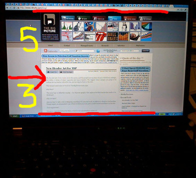
Basic principle of web design: If it's not on the screen, I can't see it.

ritz_2_screen2.jpg

Here we see Barry Ritholtz' Big Picture. On a T61 laptop in a high resolution mode, more than 60 percent (5 inches) of the screen is used for static branding graphics, and only 3 inches is available for the actual content.

The Big Picture is a timely survey of economic news and views. In its own words, it tries (and I think succeeds)

to give you a unique combination of original content, as well as referencing the best of what I find elsewhere -- MSM, Wall Street, Video, other blogs. Typically, I post a long, original piece in the early morning. Several additional pieces during the day pull information from elsewhere -- charts, news, other resources. The goal is to provide a steady stream of relevant information -- leavened with my perspectives -- all day.

November 9, 2008

Header teasers: unuseful

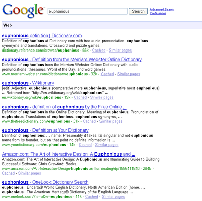
The lack of specific content in the cached header teasers of major dictionary sites is very annoying.
Better would be to show some information about the word and dictionary sites would compete on quality of definitions.

dictionary_teasers.png

October 24, 2008

Seen on the street

Bill Cunningham narrarates what he saw this week on the street in NY.
Also, the time-progress slider has a nifty usable burst-up preview.

Continue reading "Seen on the street" »

May 30, 2008

Subway Maps, overlay, by on ny turf

onnyturf overlays subway maps with street maps for New York City.
Useful ! And updated.

May 29, 2007

The scourge of unusable golf balls ?

A new study by Katherine A. Burson, a marketing professor at the University
of Michigan, shows that, when we buy things like golf balls and digital
cameras, we generally do a poor job of evaluating our skills, and so
get stuck with unsuitable products.

-- James Surowiecki

The scourge of unusable golf balls ?

Continue reading "The scourge of unusable golf balls ?" »

May 1, 2007

Fortuito.us web evangelism

Fortuito.us webtastic web evangelism by metafilter guy

April 21, 2007

Tumblr

Tumblr makes blogging easier. Demo.


September 10, 2006

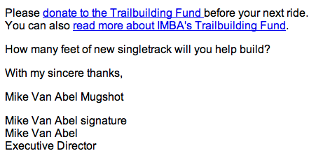
Alt text mugshot

Alt text is great for web pages; but for e-mail,
better would be to default to plaintext.

Message from the nice International Mountain Bicycling Association (IMBA) Subaru VIP Program.

April 10, 2006

Hyphen needed

What to think of loudobbs.com, home of financial reporter Lou Dobbs.

LoudObbs ? LouDobbs.

Why not Lou_dobbs.com or Lou-Dobbs.com ?

Like to watch the business commentators, especially during tax filing season.

August 2, 2005

43folders

43folders for power users and alpha geeks.

Today's tactical equivalent to Seven habits of highly effective people.


June 24, 2005

Riander, reDUX

Riander, travails of a user experience and user-centred desisgn
consultant. Who better to run DUX, aka Design for User Experience ?

May 22, 2005

dan bricklin

Dan Bricklin: a graybeard of personal computing annotates
conferences and ponders Open Source.