Main

August 15, 2016

Mind mapping

A step-by-step guide:

Plan on making your mind map in stages: a rough first draft to capture your ideas, an edited version of the draft to show their connections, and a final draft that groups information in an orderly way.

To make a mind map, you'll need a large, unlined notepad or an artist's sketchpad, and several colored pens, markers, or highlighters. If you take notes with a laptop or tablet PC, you might want to invest in software such as the Mindjet MindManager or Inspiration.

February/March 2006 issue of ADDitude

Continue reading "Mind mapping" »

January 9, 2016

KonMari: Philosophy of household goods at rest or in service


Discard everything that does not "spark joy," after thanking the objects that are getting the heave-ho for their service; and do not buy organizing equipment -- your home already has all the storage you need.

She proposes a similarly agreeable technique for hanging clothing. Hang up anything that looks happier hung up, and arrange like with like, working from left to right, with dark, heavy clothing on the left: "Clothes, like people, can relax more freely when in the company of others who are very similar in type, and therefore organizing them by category helps them feel more comfortable and secure."

Smaller, English-only under-titles:


Such anthropomorphism and nondualism, so familiar in Japanese culture, as Leonard Koren, a design theorist who has written extensively on Japanese aesthetics, told me recently, was an epiphany to this Westerner. In Japan, a hyper-awareness, even reverence, for objects is a rational response to geography, said Mr. Koren, who spent 10 years there and is the author of "Wabi-Sabi for Artists, Designers, Poets & Philosophers."

Continue reading "KonMari: Philosophy of household goods at rest or in service" »

December 12, 2015

48 movements for fitness and health

Animated illustrations of 48 movements for fitness and health.

48_movements_animated.gif

November 12, 2015

Mind maps of cities, by Archie Archambault

Archie Archambault, a designer who's making an ongoing series called "Map From the Mind." Archambault's maps are based solely on his own explorations and time spent with locals in a given city. "It seems kind of dishonest to make a map completely based on secondhand data," he says. "The tradition of mapmaking is surveying and being within the parameters of the space."

Brooklyn_mind_map.jpg

October 20, 2014

Show recent posts

"The real goal of all of these editors, curators, everybody, is to get you to come back, and the only way to get you to come back is that you are helpful, you are satisfying some need," said Charlene Li, founder of the business research firm Altimeter Group. "It's some form of mind-reading, to anticipate what it is that people want to hear about."

Ms. Li said that equation was complicated by sponsored tweets and posts, because the user must trust that the site is presenting suggested content because it thinks it's relevant, and not just to make money.

Facebook has arguably stumbled by presenting its ranking in a way that suggests that it knows best what you want to read about. And what you often want to know, Ms. Li said, is what your friends are reading about.

"The most interesting feed I find is the one that's dictated by what my friends are looking at," she said.

May 22, 2014

Death becomes all by cause

Cause vs age, via Institute for Health Metrics and Evaluation.

death_by_cause_medium.png

February 22, 2014

Online ratings: biased or manipulated ?

Online ratings are one of the most trusted sources of consumer confidence in e-commerce decisions. But recent research suggests that they are systematically biased and easily manipulated.

-- Sinan Aral, the David Austin Professor of Management and an associate professor of information technology and marketing at the MIT Sloan School of Management.

Continue reading "Online ratings: biased or manipulated ?" »

January 2, 2014

Writers' notes


David Brooks structures geographically: organize my notes into different piles on the rug in my living room. Each pile represents a different paragraph in my column. The piles can stretch on for 10 feet to 16 feet, even for a mere 806-word newspaper piece. When "writing," I just pick up a pile, synthesize the notes into a paragraph, set them aside and move on to the next pile. If the piece isn't working, I don't try to repair; I start from scratch with the same topic but an entirely new structure.

Wonderful described his process in an essay just called "Structure." For one long article, McPhee organized his notecards on a 32-square-foot piece of plywood. He also describes the common tension between chronology and theme (my advice: go with chronology). His structures are brilliant, but they far too complex for most of us. The key thing is he lets you see how a really fine writer thinks about the core problem of writing, which takes place before the actual writing.

December 14, 2013

Skew as a normative descriptor


Among the significant problems that aren't getting resolved is the site's skewed coverage: its entries on Pokemon and female porn stars are comprehensive, but its pages on female novelists or places in sub-Saharan Africa are sketchy. Authoritative entries remain elusive.

Of the 1,000 articles that the project's own volunteers have tagged as forming the core of a good encyclopedia, most don't earn even Wikipedia's own middle-­ranking quality scores.

December 10, 2013

Wikipedia's creed


Wikipedia's creed: "The encyclopedia that anyone can edit."

Aaron Halfaker's suggested revision:

"The encyclopedia that anyone who understands the norms, socializes him or herself, dodges the impersonal wall of semi-automated rejection and still wants to voluntarily contribute his or her time and energy can edit."

March 27, 2013

Clean as I've been


In the flowering of modernism between the end of the First World War and the beginning of the Second, architects forged a stainless-steel connection between housing and health. Victorian homes were a nightmare to them, a cesspit at any level of society: they were dark and stuffy; they were filled with carpets and hangings and ornate picture frames that harbored dirt and were difficult to clean; their primitive plumbing made it hard to bathe.

See Light, Air and Openness: Modern Architecture Between the Wars
By Paul Overy, reviewed by Edwin Heathcote.


The early modernists wanted to wash away this squalor with an ocean of shining chrome, tile and white plaster. Dirt-hoarding fabrics with grime-concealing patterns would be consigned to the efficient rubbish chutes. Furniture would be made from wipe-clean leather and steel. Generous windows and electric light would expose every speck of dirt. In "Light, Air and Openness," the architectural historian Paul Overy showed how the early modernists were obsessed with healthful living and influenced by the design of sanitariums.

The better home would lead to better people. Love of purity, in the words of the Swiss architect Le Corbusier, "leads to the joy of life: the pursuit of perfection." He was far from the first to tie minimalist hygiene in the home to moral purity. Adolf Loos famously connected decoration with degeneracy in his 1908 essay "Ornament and Crime." A person's soul could be cleansed only when his domestic surroundings were purged: "Soon the streets of the town will shine like white walls. ... Then fulfillment shall be ours."

Continue reading "Clean as I've been" »

March 15, 2013

Google illiterate (reader) 2


Google Reader lived on borrowed time: creator Chris Wetherell reflects

My translation: Google never really believed in the project. Google Reader started in 2005 at what was really the golden age of RSS, blogging systems and a new content ecosystem. The big kahuna at that time was Bloglines (acquired by Ask.com) and Google Reader was an upstart.

And it entered the market with big ideas, a clear, clean slate and captured the imagination of early adopters despite some glitches. The Google Reader team, which included Chris (who was the Senior Software Engineer), worked hard to keep pushing the product forward. Among the folks who worked on the project included backend guru Ben Darnell, Mihai Parparita and Jason Shellen.

I wonder, did the company (Google) and the ecosystem at large misread the tea leaves? Did the world at large see an RSS/reader market when in reality the actual market opportunity was in data and sentiment analysis? Wetherell agreed. "The reader market never went past the experimental phase and none was iterating on the business model," he said. "Monetization abilities were never tried."

"There was so much data we had and so much information about the affinity readers had with certain content that we always felt there was monetization opportunity," he said. Dick Costolo (currently CEO of Twitter), who worked for Google at the time (having sold Google his company, Feedburner), came up with many monetization ideas but they fell on deaf ears. Costolo, of course is working hard to mine those affinity-and-context connections for Twitter, and is succeeding. What Costolo understood, Google and its mandarins totally missed, as noted in this November 2011 blog post by Chris who wrote.

Continue reading "Google illiterate (reader) 2" »

March 12, 2013

Proximity in location-distance, or time ?


This post has been revised to reflect the following correction:

Correction: March 11, 2013

The Grindr app locates other people by distance, not time, as a previous version of this post stated.

The application focuses on proximity rather than location -- showing people's distance.

Continue reading "Proximity in location-distance, or time ?" »

February 28, 2013

Jonmillward studies:deep inside, a study of 10000 porn stars


Infographic artist at work:

For the first time, a massive data set of 10,000 porn stars has been extracted from the world's largest database of adult films and performers. I've spent the last six months analyzing it to discover the truth about what the average performer looks like, what they do on film, and how their role has evolved over the last forty years.

roles_titles-breakdown-large.png

-- Jon Millward's
studies: Deep inside a study of 10000 porn stars
.

September 3, 2012

b2b2c Zillow: how b2c becomes also b2b


Consumer Internet companies of the newer generation are doing even more. In many cases, the tools they are providing businesses resemble specialized versions of so-called customer relationship management services from companies like Salesforce.com, which help businesses increase sales and keep track of communications with clients.

By moving in this direction, consumer Internet companies hope to tap potentially rich new sources of revenue, which could make them more attractive to investors. A company that gets business clients to depend on a broad set of its services can make it tougher for competitors to swipe its customers.

"You can't just sell advertising without being exposed to someone else undercutting you on price," said Spencer Rascoff, chief executive of Zillow. "If you sell ads plus services, you're in a more defensible position."

Bill Gurley, a Zillow board member and venture capitalist, has seen enough hybrid Internet companies that serve both businesses and consumers that he coined a term to describe them: B2B2C. "We're moving from a day and age where you're just a Web site to one where we're automating the connections between businesses and consumers," he said.

Mr. Gurley's firm, Benchmark Capital, has invested in several other companies he puts in that camp, including Uber, which offers a mobile app that lets consumers hail a town car and gives drivers a "heat map" highlighting the areas where they are most likely to find customers.

GrubHub, another one of his investments, lets consumers order takeout and delivery food from more than 15,000 restaurants online and through mobile apps. In many cases, the service uses a clunky system in which customer orders are sent to restaurants by fax and confirmed by phone.

Recently, though, GrubHub introduced a product called OrderHub that could allow it to become more entwined in restaurants' operations. OrderHub is a tablet computer running Google's Android operating system that lets restaurants receive orders electronically, confirm them with a couple of taps and improve the accuracy of delivery time estimates.

Continue reading "b2b2c Zillow: how b2c becomes also b2b" »

August 9, 2012

Outlook is the new hotmail


Hope it has a good fast compound wildcard search: from ather about sujbec search

Microsoft admits that it's going after Gmail members with Outlook.com. Its sales pitch has three big pillars. First: unlimited mail storage. Not seven gigabytes or whatever -- unlimited.

Second, the design is far less cluttered than Gmail.

Third, no ads based on e-mail content. On Gmail, next to a message to you about a Disney World trip, you might see ads for Orlando hotels. No human reads the messages, but even a software algorithm analyzing your mail is enough to give some people the willies.

They won't have that discomfort with Outlook.com. Microsoft says that the ads are never based on your messages' contents. In fact, Microsoft lets you tailor the ads to your interests. The initial Ad Settings screen is still crude, but already you can specify categories that you are and are not interested in: yes to home electronics, no to adult diapers. It should be hard for either the advertisers or the public to argue with that basic premise: as long as you're earning this free service by seeing ads, at least they're ads you'll find interesting.

August 7, 2012

Everything Is a List: WorkFlowy


Everything Is a List
The genius of WorkFlowy

As long as I've been using computers, I've been searching for the perfect way to take digital notes. In theory, computers should be a natural place to keep all of the to-dos, reminders, meeting notes, ideas, grocery lists, and other ephemera that come streaming into our lives every day. But notes defy organization. When I get a brilliant idea or need to jot down a phone number very quickly, I often don't know where that data will fit among my other documents. As a result, word-processing software--programs that require that you put stuff in distinct files that are stored on a single computer--isn't very good for notes, because it imposes a level of structure that your notes can't live up to.

Instead, you've probably come up with other methods to take notes on your machine. Your system could be jury-rigged--maybe you write emails to yourself, maybe you keep your notes in a single Word doc or text file that's always opened on your machine--or perhaps you use dedicated note-taking or project-management software. Some people's desktops are covered in Mac Stickies. Others swear by Microsoft OneNote, Evernote, Omnifocus, Trello, ActionMethod, or Basecamp.

July 16, 2012

Two classes in America divided by I do


NY Times: marriage rates determine class; single moms drift downscale. The data, illustrated.

Continue reading "Two classes in America divided by I do " »

April 4, 2012

Matching algorithms


Other sites are trying to move past the algorithm. A start-up called myMatchmaker uses in-the-flesh people as intermediaries. Some, like Nerve.com, and How About We, aim to streamline the process and encourage interactions around more than a profile.

But Kevin Slavin, a game developer who studies algorithms, says those sites are already starting from a flawed base.

The digital personas we cultivate on Facebook are often not very indicative of who we are, he said. "A first date is the most tangible instance of you being the best possible version of yourself, the version you think will be the most attractive to someone else," he said. "It is impossible for that to be the same person on Facebook."

Rob Fishman, who helmed the development of Yoke.me, says he views the service as an icebreaker, not as a crystal ball capable of divining whether or not someone is your one true love. "We aren't saying you will want to spend your life together; you don't even know each other yet," he said. "You like the same band, talk amongst yourselves."

Continue reading "Matching algorithms" »

February 1, 2012

Gamification is superficial


Game techniques, Mr. Duggan says, prompt consumers to spend more time on company Web sites, contribute more content and share more product information with Facebook and Twitter adherents. One of his clients, he says, uses a gamification program to collect information about 300 actions -- like posting comments or sharing with a social network -- performed by several million people.

But critics say the risk of gamification is that it omits the deepest elements of games -- like skill, mastery and risk-taking -- even as it promotes the most superficial trappings, like points, in an effort to manipulate people.

Ian Bogost, a professor of digital media at the Georgia Institute of Technology, for example, refers to the programs as "exploitationware." Consumers might be less eager to sign up, he argues, if they understood that some programs have less in common with real games than with, say, spyware.

"Why not call it a new kind of analytics?" says Professor Bogost, a founding partner at Persuasive Games, a firm that designs video games for education and activism. "Companies could say, 'Well, we are offering you a new program in which we watch your every move and make decisions about our advertising based on the things we see you do.' "

Gamification may not sound novel to members of frequent-flier or hotel loyalty programs who have strategized for years about ways to game extra points. But those kinds of membership programs offer concrete rewards like upgrades, free flights or free hotel stays. What's new about gamification is its goal of motivating people with virtual awards, like a mayoralty on FourSquare, that have little or no monetary value.


What would Amy Jo Kim or Justin Hall have said ?


Continue reading "Gamification is superficial" »

January 11, 2012

Formspring


Formspring is a cross between survey sites like SurveyMonkey and answer like sites like eHow, WikiHow, YaHoo! answers and Quora.

December 26, 2011

Optimizing resume for keyword scanners


It's more than just single keywords that make you stand out from the crowd:

After all, a lot of other people are making sure that their resumes mimic the words mentioned in job descriptions as well. Instead, Lifehacker suggests that many companies now look for semantic matches, which are related terms like CPA, accounting, audits, and SEC to ensure that your resume represents real-world, useful, and related experience rather than just being stuffed with keywords. For an example of how this works, check out Monster.com's Power Resume Search Test Drive.

-- CBS

July 20, 2011

Incenting cooperation Piaza Nath


Tested by Rexford.

July 8, 2011

Placebo effectivess impresses


When testing Abilify, how was it determined that is a placebo is no better than Abilify ?

fda_insidebox_oped-art-.jpg

The box would quantify the benefits and side effects of Abilify used in combination with other antidepressants, drawing on the larger of the two six-week trials that formed the basis of its approval by the F.D.A. First, it would show how the drug scored versus a placebo (in Abilify's case, not much: only three points lower on a 60-point scale, and it resolved depression for only 10 percent of patients -- that is, 25 percent with Abilify versus 15 percent with just the placebo).

Continue reading "Placebo effectivess impresses" »

June 12, 2011

business card is already close to extinct in places like tech conventions


Gina Trapani, founder of the influential blog Lifehacker, said the business card is already close to extinct in places like tech conventions. "I see people exchange Twitter handles, I see people scan each other's badges," and send one another quick e-mails from their phones, she said. "But I definitely don't see people handing out cards anymore."

An app for the business networking site LinkedIn.com makes it easier to share contacts in person using Bluetooth. Newer sites like Hashable.com, Contxts.com and About.me allow users to create and share virtual business cards.

Continue reading "business card is already close to extinct in places like tech conventions" »

November 14, 2010

F1 2010 standing cumulative plot


Fernando Alonso, Mark Webber, Sebastian Vettel and Lewis Hamilton chase the Formula One championship..

f1_2010_as_vintage_1289410616.jpg

Via Autosport / AtlasF1

May 27, 2010

MTA transit data dump #MTADEV opens for development


#MTADEV: Build your own transit informatics for lower NY and NYC using MTA's data.

December 19, 2009

Weather out of bounds vs forecast

16 < 24

weather_nyt_2.png

December 11, 2009

Wayfinding by chirping sparrows in Penn Station

Q. Every time I wait in the Long Island Rail Road section of NYC Pennsylvania Station, I hear chirping, tweeting birds. The sound is louder near overhead speakers, so I'm assuming it's a recording. Is it supposed to make passengers calmer, like Muzak?

A. You are hearing a "talking kiosk," designed to help visually impaired passengers and others navigate the confusion of the station. The kiosk is in the Long Island Rail Road's main concourse, between the entrances to Tracks 14 and 15.

"To help visually impaired customers locate the kiosk, it emits the song of the lark sparrow (Chondestes grammacus), a bird species native to the American West, that is found by audiologists to have a unique set of phonetic properties considered effective for directional way-finding," said Susan McGowan, a spokeswoman for the railroad.

The current model was installed in December 2008, replacing an older one that also chirped. This one features a touch-activated tactile map of the station, visual displays for the partially sighted, and a voice designed for phonetic clarity, Ms. McGowan said in an e-mail message. As a customer touches different parts of the map, the kiosk describes the location and gives directions. It also offers general information about Penn Station and the Long Island Rail Road.

November 27, 2009

Retrevo laptop deals by Retrevo, a gigaom gig (cofunded-wise)

Retrevo blog and Laptop deals.


Continue reading "Retrevo laptop deals by Retrevo, a gigaom gig (cofunded-wise)" »

November 26, 2009

Coat pockets vs shirt pockets as benchmarks

CAMERAS TACKLE LOW LIGHT From the beginning of digital-camera time, the rule was: if you want to take no-flash photos in low light, you'd better buy yourself one of those big, black, heavy S.L.R. cameras. Too often, the pocket cameras that make up 90 percent of camera sales produce blurry or grainy shots in low light.

This year, the camera companies finally abandoned their decade-long obsession with megapixels. Instead, several of them began working on things that really count -- like bigger sensors for better pictures.

Panasonic and Olympus teamed up to create the Micro Four Thirds format: coat-pocketable cameras that take near-S.L.R.-quality photos. Fujifilm and Sony released new shirt-pocket models whose redesigned sensors do exceptionally well in low light. And Canon's PowerShot S90 combines an unusually large sensor (for a little camera) and a remarkable lens to produce amazing low-light shots.

Still, even these cameras may someday seem laughably crude; already, high-end cameras like the Canon EOS 5D MKII actually "see" better in low light than you do. Trickle-down theory, do your thing.

Continue reading "Coat pockets vs shirt pockets as benchmarks" »

November 16, 2009

How do you keep people coming back ?

As Bill Simmons tells it now, all he really needed to know about Internet success he learned as a nearly anonymous blogger -- the term had not gained currency, but it still fits. "The question was, how do you keep people coming back?" he said. His insights were to update his posts frequently and to be provocative, to get a discussion going among and with his readers.

Continue reading "How do you keep people coming back ?" »

November 3, 2009

Facebook feeds (FaceFeed) 2009

So three big changes:

1. The new Live Feed is linked-to at the top of the page and shows a number of new items since your last visit.

2. Highlights plus hot status updates are now the default, the new News Feed.

3. Birthdays and other important events have taken the place of the old Highlights section; they are of particular interest to users and will now be easier to see.

What It Means

Facebook says that after viewing your new News Feed, you can go check out the raw Live Stream of all the most recent updates from your contacts. That's the opposite of the way FriendFeed did it and neither strategy should be taken for granted. Decisions like this impact a major method of communication for hundreds of millions of people around the world.

Continue reading "Facebook feeds (FaceFeed) 2009" »

August 19, 2009

information is beautiful

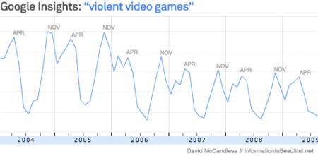
informationisbeautiful, informative charts convey information.

Example:

google_insights_2.gif

Every April and November the issue flares up. Why?

April 20th is the anniversary of the Columbine Massacre. Though dimishing, the echoes of that event still reverberate through the group mind.

Not sure about the November peak? Maybe because Christmas video games are announced?

Continue reading "information is beautiful" »

January 5, 2009

Status: either too early to tell or too late to change; Tufte on design consulting

Products under development "are in one of two states--either too early to tell or too late to change.''

He finished the book in 1982, after moving to Yale. No publisher would print it to his exacting standards. Tufte wanted the book to exemplify the design principles he articulated. It had to have lavish, abundant, high-resolution images and footnotes alongside the text so a reader wouldn't have to flip pages to find a reference. The book had to be printed on thick, creamy paper and sell for a reasonable price, about $30. "Publishers seemed appalled at the prospect that an author might govern design,'' he later wrote. So he took out a second mortgage at nearly 18 percent interest and produced the book himself.


---- Edward Rolf Tufte

Continue reading "Status: either too early to tell or too late to change; Tufte on design consulting" »

December 17, 2008

Google upgrades YouTube

Were the Channels and Subscribe features insufficient ?

Google struck back yesterday, launching two new important YouTube features. The first is YouTube's new high-definition option, which switches to wide screen and features much higher resolution than the usual fare. Since most videos are not HD-formatted, YouTube has set up an "HD Videos Area," where users can search for the highest-quality films the site has to offer. Low-resolution video has been one of the issues keeping advertisers from throwing money at the site, and this may help turn things around.

YouTube's second initiative tackles the site's maddening lack of navigability. Even though companies like CBS and MGM have signed deals to post feature-length shows on YouTube, no one can find them, thanks to the peculiar architecture of the Web site. Now, YouTube has started collecting movies, music, and news on three separate landing pages. The news page will offer video broadcasts of breaking news, and the music and movies pages will showcase the most popular songs and feature-length films, broken down by category. Users will still find themselves lost in YouTube's architecture most of the time, but at least it's a start.

-- Feeling Lucky

November 25, 2008

Head hurt bayesian

They found that Web searches for things like headache and chest pain were just as likely or more likely to lead people to pages describing serious conditions as benign ones, even though the serious illnesses are much more rare.

For example, there were just as many results that linked headaches with brain tumors as with caffeine withdrawal, although the chance of having a brain tumor is infinitesimally small.

Would such inference be addressed better by a frequentist or bayesian mindset ?

Continue reading "Head hurt bayesian" »

November 9, 2008

Header teasers: unuseful

The lack of specific content in the cached header teasers of major dictionary sites is very annoying.
Better would be to show some information about the word and dictionary sites would compete on quality of definitions.

dictionary_teasers.png

May 30, 2008

Subway Maps, overlay, by on ny turf

onnyturf overlays subway maps with street maps for New York City.
Useful ! And updated.

March 15, 2007

Queens street numbers, house numbers

Signs Indicate Queens, NY Street Numbers and House Numbers.

In order that a house number may be of greatest value in indicating
the location of its premises, the number is divided into two parts,
separated by a dash, in which the first part of the number is the
same as that of the nearest cross street or avenue, intersecting
the avenue or street to the west or north, and the second part of
the number represents the distance, as expressed in lot intervals,
between such corner and the house, a number being assigned
for each 20-foot space.

Continue reading "Queens street numbers, house numbers" »

February 6, 2007

Infosthetics

Infosthetics shows time trends.

January 24, 2007

Many Eyes interactive data visualization

Data visualization in web browser, with interaction.
New champion: IBM's Many Eyes.

Liked by JHeer and radar.oreilly.

January 5, 2007

Tag Cloud

tag cloud, an lternative to zoomclouds.

October 16, 2006

kizmeet, a slick 'missed connections'

kizmeet: example:

missed connections at NY Equinox Fitness.

October 6, 2006

Visualization and segmentation: Gelman's bag of tricks

Visualization and segmentation: Gelman's

Bag of tricks
for teaching statistics.

.

See also Gelman's Data Analysis Using Regression and Multilevel/Hierarchical Models.

October 5, 2006

Trulia, Truliablog

Trulia tracks real estate markets; updates in TruliaBlog.
Sample housing market search Great Neck NY, 3 bedroom, 2 bath.

An example of good URL engineering:
trulia.com/NY/Great_Neck/price_0-750000/baths_2-3/.


See also: Zillow.

July 14, 2006

Shakespeare @ google: soliloquy search

Comedy, tradedy, romance. The elegant design
of Shakespeare's life work.

Not yet: Browse by or search for work's name Hamlet, character
name Ophelia or search for content text nunnery.

July 8, 2006

ia flickr, ia discuss

Information architecture artifacts: ia flickr: ia discuss.

Bonus: Flickr's newr interface.

July 7, 2006

Sparklines time series

Show the time series with a sparkline.
Sparklines wiki.
Go mad with stock charts.

US Federal Budget deficit, 1983-2003.

June 20, 2006

GraphPaper / Christopher Fahey

Graph Paper / Christopher Fahey.
Beautiful design, and observations about information architecuture.

Example: full-focus states.

May 21, 2006

Snap job

Snap Job Search.
Best use of incremental search partitioning and refinement
of multi-faceted search and browsing.

Snap journal.

Battelle comments.

April 26, 2006

xplane Visual thinking

Visual thinking and marketing by Xplane.

Charmingly illustrated technology and business process graphics
remind me of Richard Scary's Busyown.

April 24, 2006

Subtraction

Subtraction by NYT designerism and ia by Khoi Vinh.

April 13, 2006

netvibes

Net Vibes aggregates information into a personal dashboard.

Like myway.com, or my.yahoo.com, but with perhaps less syndicated content.

April 4, 2006

Dashboard spy

Dashboard spy gallery of mangement dashboards and consoles full of KPI
(Key performance indicators).
Update 2006 Dec.: Moved to enterprise-dashboard.com.

Ed Tufte adds,

Continue reading "Dashboard spy" »

March 10, 2006

Cloud tags by zoomclouds

Tag soup and del.icio.us tags, and now Zoom Clouds of tags.

February 5, 2006

boxes and arrows

boxesandarrows has been upgraded.
Looks good.

You can see where the conversations are happening and
who’s having them. Each page posts stats on conversations
and people, so you can quickly find the most interesting,
controversial or insightful moments on the site.

January 23, 2006

findory turns two

Chuck Norris doesn't go hunting (for that implies the possibility
of failure), he goes killing.

Likewise omor offers find rather than search. Why search when
you can find ? And the optimistically named Findory turns two,
as recalled by Greg Linden. As findable as those polar bear guys.

December 8, 2005

RSS finds new

Rely on RSS, not new tags to find new content: undeniably geeky.

December 6, 2005

Google maps mania

Google maps mania charts the
mash ups and applications.

December 1, 2005

log base 2

logbase2 is mostly biostatistics and visualization,
with a blast of r.

Bonus (detritus ?): And compliant lefty Canadian commentary.

October 27, 2005

Google News Report USA Score

Fetch headlines from Google News on a schedule, then rank
headlines by factors:

* appearance day and time,
* prominence on the google news page,
* number of appearances,
* others;

weighted to estimate referer traffic these links bring to their
source.

Listed are the top scoring stories in recent time periods, followed
by a ranking of sources. More detailed reports are linked-to at the
bottom of each table.

[*]

October 16, 2005

Explain ia: An Exercise in Clarity

What exactly is an “Information Architect” or “Information Architecture” ?

Explain it in 10 words or less. And then, take all the words you
need to explain the difference between an information architect and
a designer (not an artist, but a designer).

-- 37signals

October 14, 2005

housing map 2

census track vs google map mash up.


Continue reading "housing map 2" »

October 11, 2005

NYT headlines

NYT headline index RSS as it's posted.
Most e-mailed 24 hours | 7 days | 30 days
Most blogged 3 days | 7 days | 30 days
Most searched 24 hours | 7 days | 30 days

obIA: Good use of multiple entry points.

September 30, 2005

Housing Map

Housing Maps
the criagslist - googlemap mash up.

See also housing maps by census.

Live near the trees.

Continue reading "Housing Map" »

September 5, 2005

Find Articles

findarticles is the poor man's Lexis/Nexis.
Can't find it there ? Try MozBot instead.

August 2, 2005

43folders

43folders for power users and alpha geeks.

Today's tactical equivalent to Seven habits of highly effective people.


July 11, 2005

GIS realtime: BusMonster Seattle

GIS realtime for commuting, BusMonster (motd) maps routes through Seattle.

With help by Intelligent Transportation Systems Research Program at UW.

Continue reading "GIS realtime: BusMonster Seattle" »

July 10, 2005

Mozbot, France's prettier Google

Search for stylized facts or for Coruscation at Mozbot, France's prettier Google.

June 24, 2005

Riander, reDUX

Riander, travails of a user experience and user-centred desisgn
consultant. Who better to run DUX, aka Design for User Experience ?

June 21, 2005

Tom Peters

The excellent Tom Peters offers pithy business advice for the post-modern
economy. Well organized site.

June 19, 2005

Google Scholar

Research citations


Google Scholar


Galegroups's review.

June 11, 2005

Tag Soup

Clay Shirky on tagsonomy: tags are cheap reader (not author/editor)
supplied metadata, having (at least) these characteristics:

1. It’s made by someone else
2. Its creation requires very few learned rules
3. It’s produced out of self-interest (Corrolary: it is guilt-free)
4. Its value grows with aggregation
5. It does not break when there is incomplete or degenerate data

And this is what’s special about tagging. Lots of people tag links on
del.icio.us.

June 6, 2005

Tagsonomy

Tagsonomy by del.icio.us offers well-categorized ontology of topic links.

April 10, 2005

Craig's List and Google Maps

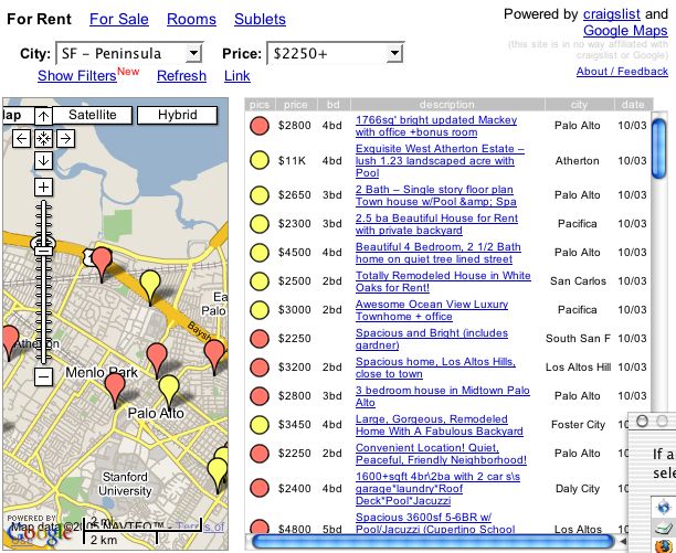
Craig's List and Google Maps merge, and the result is good.

See for rent and for sale listings plotted on a map,
pins colourized to show availability of pictures,
drill down the matches to a feature set or price band.

March 10, 2005

Leaving Asilomar

Asilomar Institute for Information Architecture is now Information Architecture Institute.

January 17, 2005

Daou Report

Daou Report ia blog portal with refreshed ledes.
Mostly political; page layout shows left is left and right is right.

January 8, 2005

Clusty headlines

Clusty headlines are groupable into clusters
by reader-specified criterion.

Clusty shows Stylized Facts as in these clusters:

Market (30)
⇨Growth (17)
⇨Statistical, Empirical (10)
⇨Interest Rates (9)
⇨Bank, Research (7)
⇨Volatility, Modeling (7)
⇨Behavior, Generate (6)
⇨Generate The Stylized Facts (5)
⇨Economic Blog (3)

Continue reading "Clusty headlines" »

November 20, 2004

scholar.google.com searches refereed publications

scholar.google.com searches refereed publications.
Sample search mortgage prepayment modlleing.

November 10, 2004

Jakob says usable Bush wins election

Jakob says usable Bush wins election [via Kos]

Continue reading "Jakob says usable Bush wins election" »